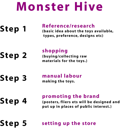
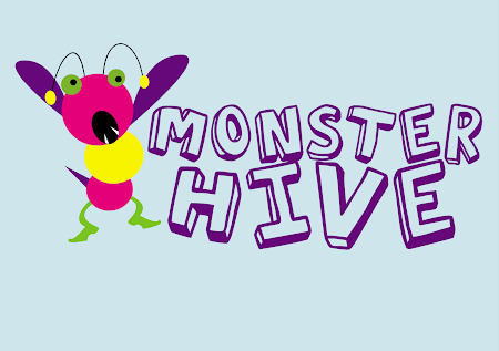
Well.. i made a few changes in the logo..like the colors and the font size..based on the feedback i got. The basic concept of the monster bee remains the same ( as i do not want to change that) . I tried associating different stuff with the brand, but nothing really worked for me.. So i'm sticking to my idea of representing the character of a Monster BEE for my store. The idea works well for me because i think it can be easily associated with the name of the brand i'm going to be producing. Along with being the symbol for the store It will also be the mascot.
So let me know what y'al think of this.
PS: The background is white and not blue.
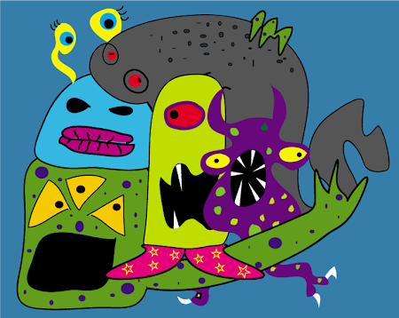
THE PROGRESSION
LOGO - REVISED
Tuesday, October 30, 2007
Monday, September 24, 2007
Your Opinion
If you do have anything interesting and creative in mind that will help me better with this project, please feel free to suggest.thanks!
Subscribe to:
Posts (Atom)